Pantone has just announced their 2021 colours – a pebble grey and a warm lemon yellow.
As interior designers, we are always keeping an eye on ‘trending’ colours, working out whether they are a flash in the pan or here to stay. Colour means so much in interior design – and not only as a superficial or aesthetic consideration.
Whether it’s a small pop of colour or statement shades, a redesigned ‘break out’ space or subtle lighting and acoustic alterations, what we see has a huge impact on how we feel, and function.
This isn’t unprecedented; in 2016 we saw Pantone crown Rose Quartz and Serenity, a cool pastel pink and a warm baby blue, as co-winners. The combination stood as a statement in a world where gender neutrality was becoming more and more important, and gender stereotyping was an attitude to be questioned rather than blindly accepted.
This year’s combination speaks more to the current global climate. Where 17-5104 Ultimate Gray might’ve been considered too industrial and too ‘depressing’ a shade on its own, alongside the cheerful and confident sunshine shade of 13-0647 Illuminating it becomes a natural foundation, harking back to pebbles at the seaside. Rock-solid strength and constancy pairs well with an aspirational, hopeful friendliness.
As Pantone puts it, “We need to feel that everything is going to get brighter – this is essential to the human spirit
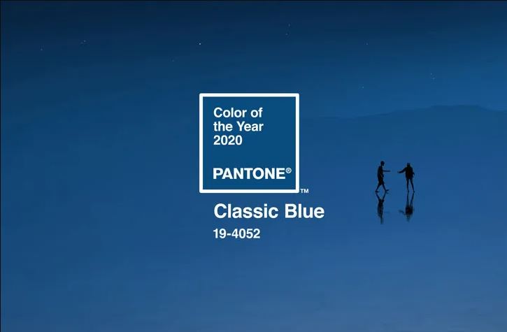
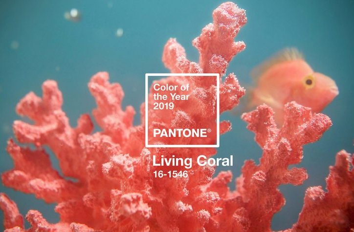
Last year’s Pantone Colour of the Year was Classic Blue, an warm-tinged oceanic tone designed to instill calm and confidence, anchoring down to the seas and propelling up into an early night’s sky. 2019 meanwhile saw a Living Coral crowned Colour of the Year, a colour which truly trended through the year alongside those copper and bronze home decor accents which came to see such popularity.


Pantone has been releasing a ‘Colour of the Year’ for more than two decades. It’s not an ‘off the cuff’ decision; Pantone’s Colour of the Year depends on thoughtful consideration as well as sophisticated trend analysis. The Pantone team comb the world for new influences each year before they announce their decision. Their sources of inspiration reportedly lie in industries as broad as entertainment and films in production, popular travel destinations, new artists, socio-economic conditions and all areas of design. They also consider new tech, materials and product development that may influence or impact colour, as well as social media platforms and even upcoming events.
Pantone is the ‘go to’ company when it comes to colour, whether you’re a designer redesigning a website, a fashion designer creating new garments or a product designer creating packaging. They standardised even the most sophisticated shades, so that they can be faithfully recreated, wherever in the world you are.. Pantone’s Pantone Matching System has been allowing product development, design and purchasing decisions to rely on faithful and consistent colour matching since they revolutionised the printing industry in 1963.
We sweat the small stuff – whether that’s the incremental differences in Pantone shades or the exact lighting that will work for your space. If you have a project in mind, get in touch with us today to chat through what we can do for you.